So for a long time, I want to find a way to address my GO problem in my life forever. However, eventually I did not found one, some R packages seems not working, and some other online tools are too hard to understand for me. So eventaully I found David online tool is a good choice. It's easy to use, easy to implement, and with ggplot2 I can draw nice plot quickly.
1. Prepare gene list
Firstly, we need to prepare our gene list to David, no P value is need, in my case, I directly used clipr to copy the object into system clipboard, which is so easy and nice. clipr could directly past across server, like my previous post said.
df <- TCLT.volcano$df
tmp <- df[df$FDR <= 0.05 & !is.na(df$symbol), ]
clipr::write_clip(tmp$feature)
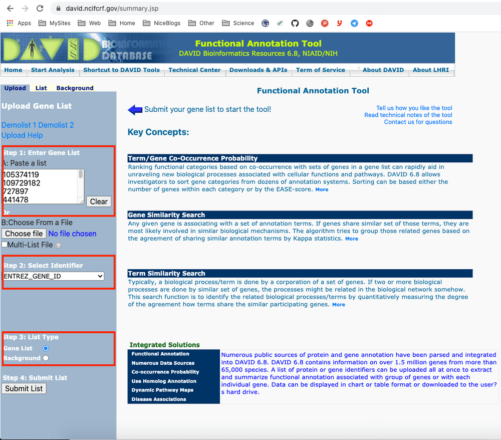
The gene feature is Entrz_ID here, you may use other gene name like Esemble name, Symbol .etc:
> head(tmp$feature)
[1] "105374119" "109729182" "727897"    "441478"    "406961"    "100423037"
2. Paste into David
Then I paste it into David online tool.
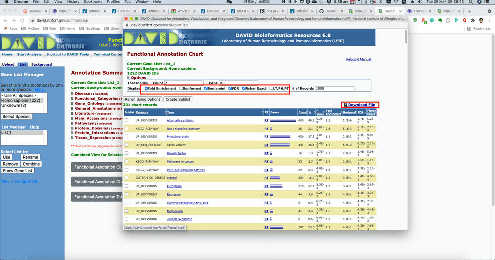
Then select Functional Annotation Chart, slightly modify the parameters, like ask to return Fold Change for visualisation. etc. Then select Retrun Using Options. Finally on the top-right there is button showing Download File, which is a URL we can directly load via R.
3. Calcualte Z-Score with GOplot R pacakge
Finally we can directly load the URL content for visualisation. Firstly I want to calculate the z-score for each enriched pathway. Here I use the circle_dat() function from GoPlot package.
library("GOplot")

David <- read.csv("https://david.ncifcrf.gov/data/download/chart_AA6917612AEE1620101903486.txt", sep="\t")

goDavid <- David[,c("Category", "Term", "Genes", "FDR")]
colnames(goDavid) <- c("category", "term", "genes", "adj_pval")
geneList <- tmp[,c("feature", "Fold", "p.value", "FDR")]
colnames(geneList) <- c("ID", "logFC", "P.Value", "adj.P.Val")
circ <- circle_dat(goDavid, geneList)
After calculation, the circ object looks like below:
> head(circ)
     category                 term count  genes      logFC     adj_pval
1 UP_KEYWORDS Alternative splicing   600 730112 -0.9857185 2.719938e-06
2 UP_KEYWORDS Alternative splicing   600  23604  1.2144389 2.719938e-06
3 UP_KEYWORDS Alternative splicing   600 340371 -1.6496193 2.719938e-06
4 UP_KEYWORDS Alternative splicing   600   9180 -3.9085765 2.719938e-06
5 UP_KEYWORDS Alternative splicing   600 348093 -1.4192143 2.719938e-06
6 UP_KEYWORDS Alternative splicing   600   9187 -3.7186476 2.719938e-06
     zscore
1 -21.47386
2 -21.47386
3 -21.47386
4 -21.47386
5 -21.47386
6 -21.47386
>
Note that we should only keep unique rows. Like running below two code. Also, I annotated BP/CC/MF.
df <- circ[,c("category", "term", "count", "adj_pval", "zscore")]
df <- unique(df)
df$GO <- "Other"
df$GO[df$category == "GOTERM_BP_DIRECT"] <- "BP"
df$GO[df$category == "GOTERM_CC_DIRECT"] <- "CC"
df$GO[df$category == "GOTERM_MF_DIRECT"] <- "MF"
4. Draw bubble plot with ggplot2
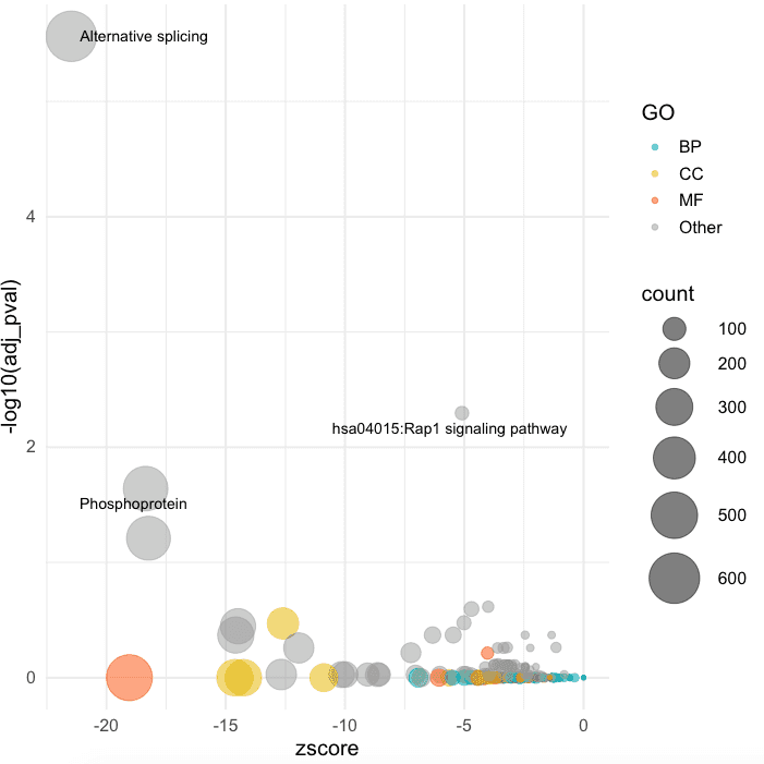
Finally, I use ggplot to draw simple bubble plot:
library("ggplot2")
library("ggrepel")

ggplot(df, aes(x = zscore, y = -log10(adj_pval))) +
  geom_point(aes(color = GO, size = count), alpha = 0.5) +
  scale_color_manual(values = c("#00AFBB", "#E7B800", "#FC4E07", "#999999")) +
  scale_size(range = c(1, 15)) +  # Adjust the range of points size
  theme_minimal(base_size = 14) +
  geom_text_repel(data = df[df$adj_pval <= 0.05, ], aes(label = term),
                  size = 3.5, box.padding = unit(0.35, "lines"), point.padding = unit(0.3,"lines"))

