Here I want to create a quick react APP to show density plot for Human Methylation array data. I know it's kind of like reinventing wheel, but I think it's better than already give my collegeus R plot.
Create React Density Plot
Firstly I need to created a react app on my github. I just used the most simply react-cli tool to create the site:
npx create-react-app densityPlotAfter enter the densityPlot folder, I can start the project now:
npm start Then website should be running now on http://localhost:3000/. Then I need to create a density plot line component. Here I used the react-chartjs-2 package. Charts.js is a light-weight pacakge for quick data visualization. I modified the App.js file as below: Removed all extra functionality but LineChart page.
import React from 'react';

import LineChart from "./page/LineChart"

function App() {
  return (
    <div className="App">
      <header className="App-header">
        <LineChart />
      </header>
    </div>
  );
}

export default App;
Then, the hard part is here, create a line chart page. After trying a while, I implemented a simple version in /page/LineChart.js below. We can see that the key part is data in state, merely which contains a labels, and a data. Then, one object in data should indicates one online. In other word, we just need to organise the density plot for methylation data into the data format, then fit into this page.
import React from 'react';
import { Line } from 'react-chartjs-2'

class LineChart extends React.Component {
  constructor(props) {
    super(props);
    this.state = {
      data: {
        labels: ['January', 'February', 'March', 'April', 'May', 'June', 'July'],
        datasets: [
          {
            label: 'My First dataset',
            fill: false,
            lineTension: 0.1,
            backgroundColor: 'rgba(75,192,192,0.4)',
            borderColor: 'rgba(75,192,192,1)',
            borderCapStyle: 'butt',
            borderDash: [],
            borderDashOffset: 0.0,
            borderJoinStyle: 'miter',
            pointBorderColor: 'rgba(75,192,192,1)',
            pointBackgroundColor: '#fff',
            pointBorderWidth: 1,
            pointHoverRadius: 5,
            pointHoverBackgroundColor: 'rgba(75,192,192,1)',
            pointHoverBorderColor: 'rgba(220,220,220,1)',
            pointHoverBorderWidth: 2,
            pointRadius: 1,
            pointHitRadius: 10,
            data: [65, 59, 80, 81, 56, 55, 40]
          }
        ]
      }
    }
  }

  render() {
    return (
      <div style={{ height: '80vh', padding: '3em' }}>
        <Line
          data={this.state.data}
          width={100}
          height={40}
          options={{ legend: { display: false } }}
          redraw />
      </div>
    );
  }
}

export default LineChart;
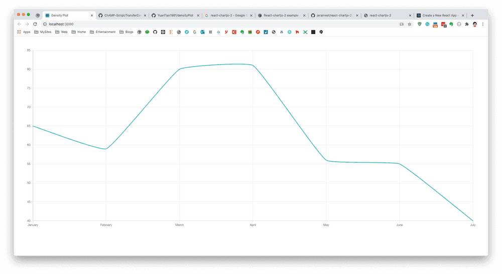
Then the page should show a simple line already.
The React part is nearly done, now we need to generate density plot for DNA Methylation Array.
Prepare Density Plot Line
Then I need to prepare the methylation array data. It could be normalized, Combat corrected, etc. In my case, I saved the matrix and pd file into a R file:
save(myCombat, QC, pd, file="myCombat.rda")Here QC/pd are phenotypes for myCombat matrix, which contains some categorical information, which could be used to separate colour.
If we want to calcualte/plot density plot, we need to firstly calculate this line. The density line is a fitted line based on dots you have. Manye people knows in R, we can use plot(density(data)) to generate a density plot. So actually, the density() function could indeed return you the x and y data for each fitted line.
Here I wrote a function to calcualte density line for each sample. You can see it's actually a bit stupid but I just actually using R to create a list for each sample. The attibute in above JS code is exactly the same here as name in below oneSample list object.
load("./myCombat.rda")

beta <- myCombat

getPoints <- function(i) {
    tmp <- density(beta[, i])

    if(QC[i,"Density Plot - Manaually Removed (Agreed)"] == "Accept") {
        tmpCol <- "rgba(75,192,192,1)"
    } else {
        tmpCol <- "rgba(245,158,66,1)"
    }
    oneSample <- list(label = colnames(beta)[i],
                      fill = FALSE,
                      backgroundColor = tmpCol,
                      borderColor = tmpCol,
                      borderCapStyle = "butt",
                      borderDashOffset = 0,
                      borderJoinStyle = "miter",
                      pointBorderColor = tmpCol,
                      pointBackgroundColor = "#fff",
                      pointBorderWidth = 1,
                      pointHoverRadius = 1,
                      pointHoverBackgroundColor = tmpCol,
                      pointHoverBorderColor = "rgba(220,220,220,1)",
                      pointHoverBorderWidth = 2,
                      pointRadius = 1,
                      pointHitRadius = 2,
                      data = tmp$y[seq(1, 512, by = 8)])

}

datasets <- list()
for (i in 1:ncol(beta)) {
    datasets[[i]] <- getPoints(i)
}

library(jsonlite)

sink("density.json")
toJSON(datasets, auto_unbox = TRUE, pretty=TRUE)
sink()
In above code, since I have two phenotypes in "Density Plot - Manaually Removed (Agreed)" column. I assigned different colour in it. I iterated the all sample, calculated the density with R density() function: tmp$y[seq(1, 512, by = 8)]. Then selected 64 points along the density line (too much dots would slow down the page, but the line trend would looks similar). After calculation of everything, I exported the list into density.json file, which looks like below:
[
  {
    "label": "UCL03",
    "fill": false,
    "backgroundColor": "rgba(75,192,192,1)",
    "borderColor": "rgba(75,192,192,1)",
    "borderCapStyle": "butt",
    "borderDashOffset": 0,
    "borderJoinStyle": "miter",
    "pointBorderColor": "rgba(75,192,192,1)",
    "pointBackgroundColor": "#fff",
    "pointBorderWidth": 1,
    "pointHoverRadius": 1,
    "pointHoverBackgroundColor": "rgba(75,192,192,1)",
    "pointHoverBorderColor": "rgba(220,220,220,1)",
    "pointHoverBorderWidth": 2,
    "pointRadius": 1,
    "pointHitRadius": 2,
    "data": [0.0036, 0.0335, 0.2013, 0.7826, 1.9933, 3.4099, 4.0842, 3.6472, 2.6644, 1.7891, 1.2217, 0.8922, 0.6995, 0.5815, 0.5059, 0.4553, 0.4202, 0.3946, 0.3748, 0.3603, 0.351, 0.3444, 0.3392, 0.3364, 0.3365, 0.3383, 0.3407, 0.3431, 0.346, 0.3509, 0.3592, 0.3703, 0.3832, 0.3976, 0.4146, 0.4345, 0.457, 0.4808, 0.5044, 0.5275, 0.5505, 0.574, 0.602, 0.6396, 0.6862, 0.7388, 0.7974, 0.8651, 0.9469, 1.0487, 1.1763, 1.3379, 1.5404, 1.7746, 2.0001, 2.1382, 2.0848, 1.7642, 1.2268, 0.6633, 0.2651, 0.0751, 0.0147, 0.0019]
  },
  {
    "label": "UCL05",
    "fill": false,
    "backgroundColor": "rgba(245,158,66,1)",
    "borderColor": "rgba(245,158,66,1)",
    "borderCapStyle": "butt",
    "borderDashOffset": 0,
    "borderJoinStyle": "miter",
    "pointBorderColor": "rgba(245,158,66,1)",
    "pointBackgroundColor": "#fff",
    "pointBorderWidth": 1,
    "pointHoverRadius": 1,
    "pointHoverBackgroundColor": "rgba(245,158,66,1)",
    "pointHoverBorderColor": "rgba(220,220,220,1)",
    "pointHoverBorderWidth": 2,
    "pointRadius": 1,
    "pointHitRadius": 2,
    "data": [0.0001, 0.0015, 0.0144, 0.0861, 0.3295, 0.8453, 1.541, 2.1423, 2.451, 2.4676, 2.2959, 2.0427, 1.7799, 1.5411, 1.3392, 1.1749, 1.0396, 0.9238, 0.8211, 0.73, 0.6519, 0.5858, 0.5318, 0.4926, 0.4681, 0.4551, 0.4503, 0.4526, 0.4608, 0.4713, 0.4828, 0.4961, 0.5105, 0.5264, 0.5439, 0.5612, 0.5791, 0.5983, 0.6169, 0.6347, 0.6536, 0.6714, 0.6851, 0.6951, 0.7041, 0.7156, 0.7316, 0.7555, 0.7975, 0.8763, 1.0198, 1.238, 1.4913, 1.7068, 1.8331, 1.86, 1.7923, 1.6159, 1.2909, 0.8332, 0.3936, 0.1256, 0.0256, 0.0032]
  },
  ...
Now I have get the density line data for all sample, and nicely in JSON format. Finally I want to integrate them into react website code.
Integrate JSON into React
Create a path as assets/js under src folder of React project, create a new file name as dataset.js. Then copy-paste the density.json file in. (Or just copy the file into the path, then rename it as dataset.js). Finally, open the dataset.js file, add two letter at head: 'export default'
export default [
  {
    "label": "UCL03",
    "fill": false,
    "backgroundColor": "rgba(75,192,192,1)",
    "borderColor": "rgba(75,192,192,1)",
    "borderCapStyle": "butt",
    ...
Then we can modify the /page/LineChart.js, load the data. And assign this value to the datasets key in data object.
...
import mydata from "../assets/js/datasets"

class LineChart extends React.Component {
  constructor(props) {
    super(props);
    this.state = {
      data: {
        labels:  ['January', 'February', 'March', 'April', 'May', 'June', 'July'],
        datasets: JSON.parse(JSON.stringify(mydata))
      }
    }
  }
  ...
Finally, we need to modify the labels in LineChart.js page. Here I used the R to generate 64 x axis between 0 and 1. I used below R code:
> paste(round(seq(0,1,length.out=64),3),collapse=",")
[1] "0,0.016,0.032,0.048,0.063,0.079,0.095,0.111,0.127,0.143,0.159,0.175,0.19,0.206,0.222,0.238,0.254,0.27,0.286,0.302,0.317,0.333,0.349,0.365,0.381,0.397,0.413,0.429,0.444,0.46,0.476,0.492,0.508,0.524,0.54,0.556,0.571,0.587,0.603,0.619,0.635,0.651,0.667,0.683,0.698,0.714,0.73,0.746,0.762,0.778,0.794,0.81,0.825,0.841,0.857,0.873,0.889,0.905,0.921,0.937,0.952,0.968,0.984,1"
Just copy-paste above result into label. Now I have:
class LineChart extends React.Component {
  constructor(props) {
    super(props);
    this.state = {
      data: {
        labels: [0, 0.016, 0.032, 0.048, 0.063, 0.079, 0.095, 0.111, 0.127, 0.143, 0.159, 0.175, 0.19, 0.206, 0.222, 0.238, 0.254, 0.27, 0.286, 0.302, 0.317, 0.333, 0.349, 0.365, 0.381, 0.397, 0.413, 0.429, 0.444, 0.46, 0.476, 0.492, 0.508, 0.524, 0.54, 0.556, 0.571, 0.587, 0.603, 0.619, 0.635, 0.651, 0.667, 0.683, 0.698, 0.714, 0.73, 0.746, 0.762, 0.778, 0.794, 0.81, 0.825, 0.841, 0.857, 0.873, 0.889, 0.905, 0.921, 0.937, 0.952, 0.968, 0.984, 1],
        datasets: JSON.parse(JSON.stringify(mydata)),
      }
    }
  }
  ...
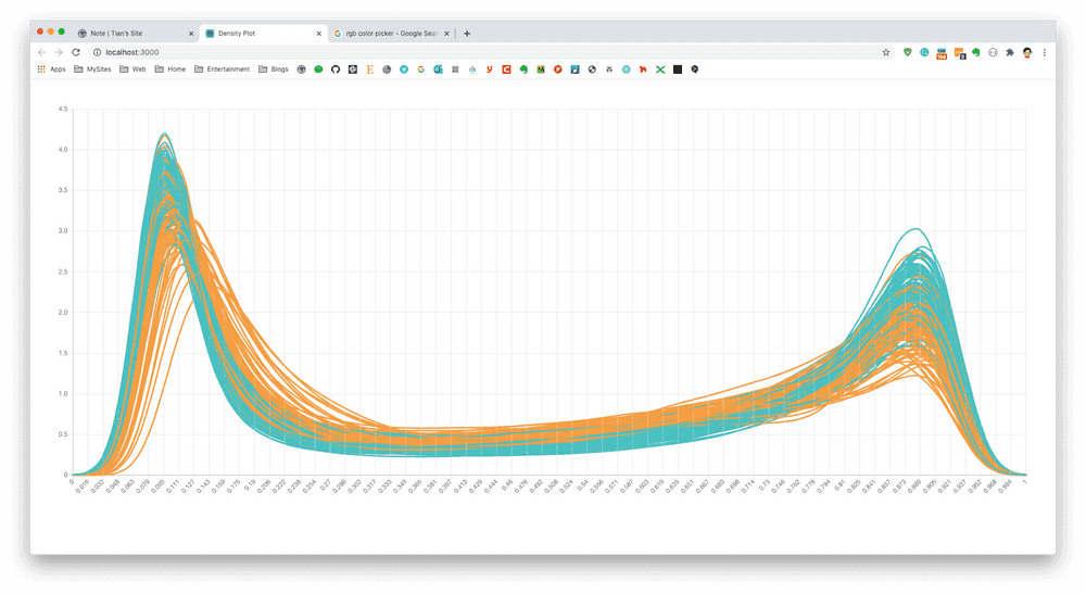
Now the it works:

